Jillian helped out with initial concepting for this cute shoot for Nonpareil, inspired by Alfred Hitchcock’s “To Catch a Thief” and one of our first colorboards designed by Amanda.
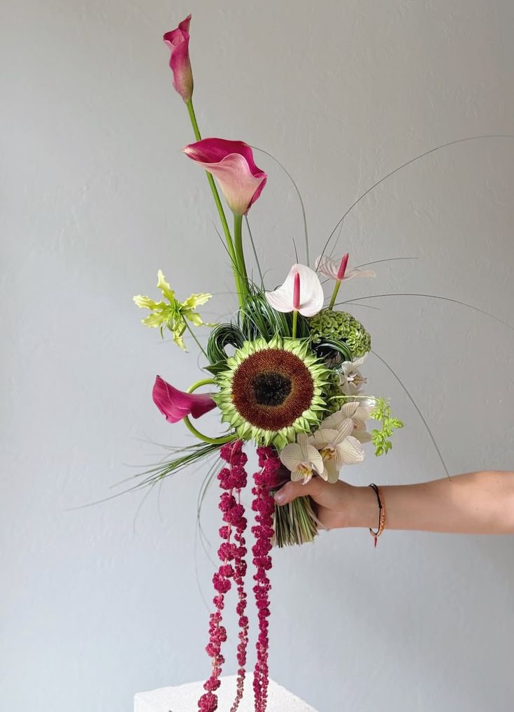
Cute, no? The flowers from Blossom and Branch are gorgeous. And you can download templates for the paper pretties from Seamless Paperie on Nonpareil.
Paper Goods and Styling by Courtney Dolloff of Seamless Paperie
Floral Design and Styling by Sarah Brysk Cohen of Blossom and Branch
Photography by Maggie Harkov


really glamourous and sweet… I love it.
Congratulations for your great job, I follow you!!
love the vintage feel of the color pallete! Beautiful!
Kim @ http://frostmeblog.blogspot.com
party inspiration
I’m totally obsessed with that numbered scotch glass…it’s glam, it’s golden, it’s PERFECT!
I am loving all the shades of blue and what clever place cards!
I love the numbers! Will you share their font name?
Thanks so much for the feature Jillian!!
@Katie The font for the numbers is Normande.
I love the old Hollywood feel of this color pallette! It is so chic!
Also, forgot to add that all of these gorgeous photos were taken for us by Maggie Harkov, whose work you can find here: http://www.maggieharkov.com/
I just adore this color scheme! Thank you for the lovely post!
The flowers are absolutely stunning, but I really fell hard for the place cards in little jewel boxes. This shoot was one of my favorites, but the whole magazine looked so gorgeous that it was impossible to pick a winner!
oh so clever and wonderful … especially love the ringbox placecard holders–first time I’ve seen that anywhere and a charming idea!
I am in love with those shades of teal glasses… where could I find those?
What a great theme! It looks so pretty!
so lovely! what’s the name of the sans serif font and the scripty font?
I like the antique stamps on the invite envelopes and all the colorfullness.
Look at these ideas and wedding discounts at:http://urlmule.com/?5620
Glad there’s so much love for the ring boxes! It was definitely fun to come up with those little details. And by the way if any of you are interested, I have a box of extras lying around that I won’t be using, so feel free to email me if you think you could use them for your own event. I’d be happy to give them a new home.
@ Jessica: by the scripty font I assume you mean the one for “merci”? That is also Normande, just the italic version. And the skinny sans serif is Cyclone by HF&J. It is just the Inline layer used by itself.
Hi All!
Thanks so much for all the LOVE – we had a wonderful time putting this together. The teal glasses are actually a family heirloom from my 103-year-old Grandma Rhea (Hi Grandma!). They are Czech glass from the 1930′s. I have seen similar jadeite in a range of colors at flea markets and antique shops. I imagine Etsy might have some fun options, as well!
should’ve guessed the HF&J. thanks!
Love it all! Such a beautiful job!!
LOVE the flower arrangements! They really make the table!
love, love, LOVE this shoot! Thank you so much for posting it and to the extremely talented Courtney Dolloff of Seamless Paperie because the invite download is exactly what I’ve been hoping for. These are going to become my invitations! (and thanks for the font info!) Thank you so much!!!
The ring box place settings and the simple name tags hold the theme, and the invitations add mystery to how the wedding will look… to how the reception will tie in. A creative, thoughtful theme with all the right accents–the most important being the bride who stole the groom’s heart (or is that the other way around?).
gorgeous as always ladies!
Thank you so much for posting it and to the extremely talented Courtney Dolloff of Seamless Paperie because the invite download is exactly what I’ve been hoping for.
Lovely pictures.. The color combination is super refreshing!
I don’t know the movie, but this photo shoot is simply brilliant! I love the bright, cheery color scheme!
Yay! This was such a pleasure to be a part of! Thanks so much for featuring this, Jillian!
I love the scheme and well done to Maggie Harkov for capturing the moment.
I love the rich royal blue and marigold color combination – it’s absolutely brilliant and classy! I also love the antique keys! Was the gold key on the envelope stamped or printed on? It’s simply marvelous!
I wish there was a place to download these now that nonpariel is down.
Hi,
Does anyone know where this could be downloaded? The link is no longer working and i was wondering if there is still a way to get this printable?
Thanks!