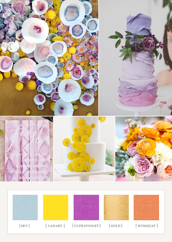
This board was inspired by all the yummy bits of gold we’ve been seeing around the blogs. Why not mix it with vintage florals and greens?
(PS. Metallic is a hard swatch to create, so pretend ours is *actually* golden.)
cabin 7, Nicolette Camille, Conroy & Wilcox via Randi Brookman Harris’s blog, Alexandra Grablewski.
13 comments


The LOVE blocks and the golden spoons are lovely!
This is a really soothing palette!
thanks so much for including our LOVE blocks! so fun running into you at the Flea, Jillian! xx
this is the palette for the kitchen tea i’m planning! its got that whimiscal french vintage look my sister will love!!!!
Awesome palette… these are some of my fave colours as it is, and they look great together
BEAUTIFUL..love love love the blocks…
I love the cute vintage vibe, the teacups are adorable!
I LOVE this palette. I’ve never been a huge fan of gold, but I love it in this. Those tea cups are fantastic.
the BLOCKS i LOVE!
The colors blend well together. I would say use hints of gold in the accessories as it seems to be a more “hard” tone.
What a pretty board! So inspiring, and I love the blocks.
Love, love, LOVE those colors together! Very whimsical…
I would like to encourage my friend here to submit thier website url at our newly developed directory website.
edmonton wedding planners
NO registation required
your website will approved and get list within 24 hrs after your submission
thanks in advance