7 May

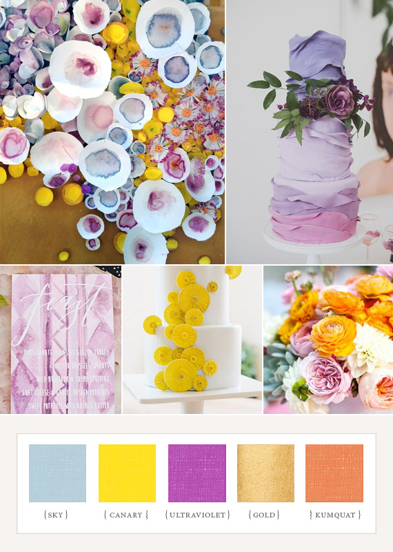
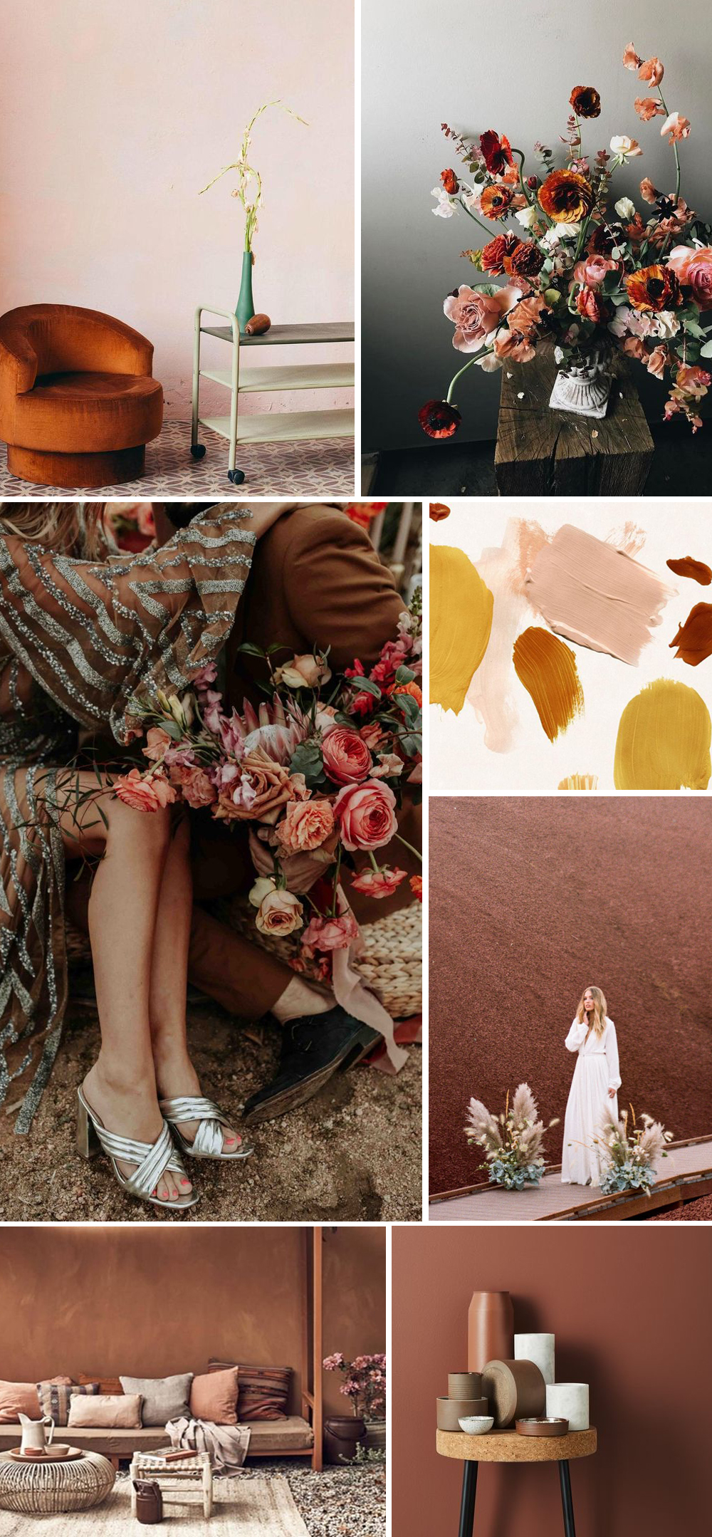
Yay, the color boards are back! We haven’t done one of these in forever.. sorry about that. We do love making them, so we promise to keep them up, starting with this color scheme for my wedding. I’m not really sure what our theme would be called.. the colors are 60′s-inspired brights mixed with neutrals. Think glamorous Mad Men, but with a modern twist. It’s so exciting to see it all come together now! I designed my invitations (for the most part), and am thinking about having them screen printed. Will show the work-in-progress soon!

xo, Amanda

Retro bright wedding colors

{Clockwise from top left: Casa de Perrin, Vera Wang Lavender, Ashley GoldbergMaison 140 in Lonny Magazine, Ladyfingers Letterpress, Lael Cakes}

Related Posts with Thumbnails
 

Comments

  1. Beautiful inspiration! And I WANT that cake.

  2. Love these punchy colors together with the gold! Such a fun and sophisticated palette.

  3. This is such an awesome blog.This blog have truly very good information about new trends of cloths this is fantastic. I’ve seen in a LONG time! Love it!

  4. How glam and perfect is this? Can’t wait to see the colors come to life!

  5. Love the colours, Amanda! Looks like ‘Playful Glamour’ to me. And those SHOES! They rock (literally!).

Post Your Comment

Hello Cakelets! Thanks so much for reading our blog. If you're going to leave a comment, know that we reserve our right to remove any mean-spirited, unreasonably profane, self-promoting comments from our blog. And remember that the couples shown on our site are real people who have been nice enough share their special day with us. Please treat them as you'd like to be treated. XOXO