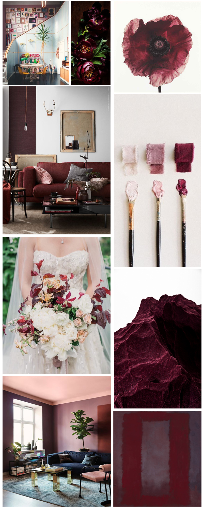

Left to right, top to bottom: Flickr, FFFFOUND (does anyone remember the original source?), not sure about the map, Rachel Papo via oh joy, Cynthia Warren via mika 78.
Left to right, top to bottom: Flickr, FFFFOUND (does anyone remember the original source?), not sure about the map, Rachel Papo via oh joy, Cynthia Warren via mika 78.
Book a stellar 100 Layer Cake-approved Event Pro on your date, style, and budget with ease…
![]()
Are you an Event or Production Pro? Apply to join us!
Book a stellar 100 Layer Cake-approved Event Pro on your date, style, and budget with ease…
![]()
Are you an Event or Production Pro? Apply to join us!